Introducing Aquamorphic Design: the creative and human-centric design behind the new OPPO ColorOS 13
- Written by Telegraph Magazine
“A good design is about initiate dialogues amongst modern civilisations, and responding to people’s needs. The ultimate goal of any piece of product design is to relieve people of their difficulties and to enhance our quality of life.
” - Xi Zheng, Director of Software Design, OPPO SHENZHEN, CHINA - Media OutReach - 31 August 2022 - In the modern digital age, people have long become used to gaining easy access to vast amounts of information through various technological devices. As people's reliance on smart devices increases, and with the costs of device usage and maintenance keeps on surging, technology has not only brought more about convenience to our live, it also inevitably gives rise to anxiety. The over-abundance of information is drowning out people's capacity to reflect, at the same time forcing them to live in the fear of missing out.
That's not all. Social instability, the deterioration of our natural environment, and the global pandemic have all forced us to adapt and evolve to the ever-changing external environment, and to thrive in a future of uncertainty. As the spearhead to our future, designers are tasked with critically tackling the uncertainties to reassess our potential to thrive and to make contributions to the world around us.
ColorOS is a highly-customized, efficient, intelligent, and richly designed Android based OS from OPPO, with over 500 million global monthly active users. In the latest version of its ColorOS, OPPO hopes to adapt to people's needs through constantly exploring the interactions between technological devices and modern users, as well as understanding the spiritual relationship between the nature and human beings. The OPPO ColorOS provides users with the right solutions, the convenience, and the naturalness of integration between technology and humans, reaching an impeccable synthesis of innovative technology and modernistic aesthetics.
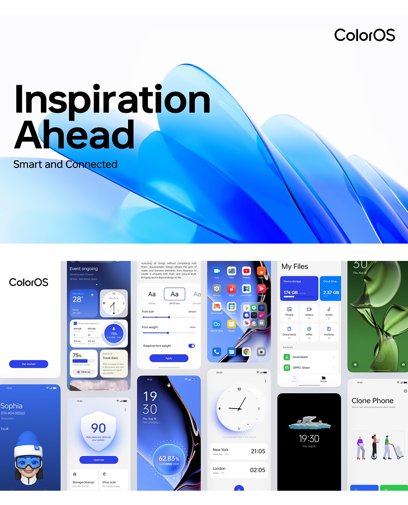
In August 2022, ColorOS welcomed a new chapter in its history with ColorOS 13, introducing the brand-new, human-oriented Aquamorphic Design. Aquamorphic Design on the ColorOS 13 aims to deliver a highly popular aesthetics through its organic and minimalistic interpretation, with a functional goal to solve our everyday problems in this information-booming era. With ColorOS 13, we encourage users to live a vibrant and gratifying lifestyle, looking forward into uncertainties with optimism, courage and determinism.
Echoing with the modern aesthetics: the Aquamorphic Design
Nature breeds all life, and water is the essence of life on earth. Through the exploration and expression of the laws of nature, OPPO has weaved its vitality into technology with Aquamorphic Design on ColorOS 13.
It took more than 100 engineers over half a year to perfect the Aquamorphic Design — a concept which aims to give ColorOS 13 unlimited possibilities by enabling it to adapt itself to any environment. This concept takes inspiration from the multifariousness, compactability, and openness to interactions in the unlimited physical possibilities of water molecules – from its ubiquitous vapourous form to its sharp, tough ice-like rigidity. Like water, ColorOS 13 represents OPPO's root determination for innovation, adaptability to changes, and intrinsic simplicity. We aim to sense and adapt to different devices and user habits, and redefine the relationships between people and the digital world with ColorOS 13. All the while, users interacting with ColorOS 13 are required no additional effort to learn. ColorOS 13 inconspicuously and gently bearing the weight to assist users for an accommodating, personal, and intuitive experience.
To counteract the feeling of fatigue brought by the pandemic, the first port of call in bringing this natural vitality to ColorOS 13 was to completely overhaul the visual elements in the OS.
ColorOS 13's color theme is inspired by the hue transition on the skyline between sunrise and sunset. From the sapphire of a sunrise to the orange of a sunset, this color gradient is applied to the system space and icons, bringing users a sense of vitality and inclusiveness. This evolving color is anchored around a central shade of blue, which not only reflects the OS's aqueous theme, but also induces the feeling of serenity and reliability. In a similar way, the icons, windows, cards, and input boxes in ColorOS 13 all feature more rounded and organically gentle contours to mirror the flow of water and symbolize the endless vitality of life.

The OPPO Sans font in ColorOS 12 recentely won a Red Dot Design Award — has also received an update in ColorOS 13. The font features slightly wider text for a more stable appearance, while the text layout has been updated to create a more stereoscopic present that accentuates clarity, improves readability and visual comfort on a variety of screen display sizes.
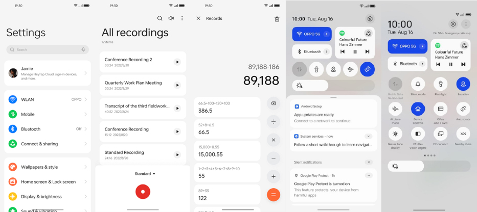
Creating a systematic and convenient user experience in the often disorderly and complex information system is also central to us. We came up with a new solution to avoid information overload — the Card-Styled Layout. It classifies and intergrates scattered information to simplified interface presentation, enlarging the most important information and re-arranging it in an easy-to-read layout. This new design enables users to quickly get hold of the desired information they need most with the least amount of effort, all without noticing the magic of the design working tirelessly away in the background, mirroring the inconspicuous and gentle appearance of water in nature – being important, yet appearing weightless.
During the refinement process to the Control Center, controls have also been grouped and classified using the Card-Styled Layout to create a clearer information hierarchy, amplify commonly used information, and group similar information all in one accessible place.
The soft Aquamorphic Effect from of Aquamorphic Design in ColorOS 13 allows every interaction to feel completely natural and fluid, while providing a soothing sensation that brings the user closer to nature.
For example, the Fingerprint Unlock and Optimize functions are accompanied by an animated ripple effect. When the device is charging, water droplets converge to the middle of the screen. When switching between interfaces, a Gaussian blur effect creates the realistic visual sensation of looking at the bottom of a lake through the water, with the background image appearing faintly below. On top of these design touches, the Shadow Reflective Clock mimics the transistions of the sun's rays from dawn till dusk, and the shadows casted by moonlight. The automatic shifts between lights and shadows of the clock adjust gradually depending on the time of day and night by the use of device, creating a vivid reminder to the beauty in the passage of life.
ColorOS 13 includes an upgraded Quantum Animation Engine with improved animative details and the simulations of mechanical trajectory movements and stationary states of virtual objects. This makes the animations feel even more lifelike and connected to the natural world, reducing the sense of detechment between the the digitial world and the reality.
Behavioral Predictions has also been added to process multi-gesture operations and provide intelligent, accurate, and rapid visual responses. For example, if a user slides up on the screen to exit an app and to abort a previous instruction to open the app, the system would respond immediately by suspending the previous opening instruction and to proceed directly to the real-time aborting response. Color OS 13 provides a cutting-edge technology to promote the operating fluency to a new level.
Meeting the needs of today: new functions built on the latest technology
The pandemic has completely changed the way we live our lives, introducing us with a novel remote-working mode that requires the simultaneous use of multiple devices has placed fresh demands on user experience. ColorOS 13 has been upgraded to address the users' evolved demands by introducing a series of intelligent functions designed for the needs of today.
As more smart devices are introduced into our lives, the demand for a reliable central OS that operate in tandem with the variety of hardware is vital for users to make the most out of their devices. When concurrently working on a computer, smartphone, or tablet, ColorOS 13's upgraded Multi-Screen Connect improves multitasking by enabling users to switch between devices in a more seamless and natural manner, therby increasing work efficiency. Meanwhile, the Adaptive Layouts of the ColorOS 13 ensure that users can enjoy the same familiar and consistent experiences on devices with different screen sizes, such as mobile phones and tablets, without any additional learning. ColorOS 13 also inherits the Red Dot Award-winning Two-Finger Split Screen function from ColorOS 12, which offers more flexibility and efficiency for multitasking on larger screens.
After addressing the core and universal needs of most users, ColorOS 13 is also designed to provide a more personalized and customized experience. Users can choose from a variety of design elements and theme colors in the system according to their own preferences, and add Home Screen Widgets that suit their usage habits, customizing their own operating system to display information that is personalized to their needs.
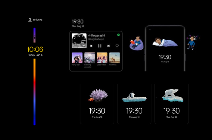
The Always-On Display (AOD) in ColorOS 13 has also been purposely designed to prioritize the presentation of important information, while also acting as a buffer to protects users from unnecessary and superfluous message disruptions. This allows users to concentrate their attention only on direct and concise information, with minimal diversions on time-consuming and redundant information. Through the Smart AOD, users can review the statuses of food delivery without turning on the home screen of their phone. OPPO has also entered into a partnership with Spotify that brings convenient music control to the AOD. User can access to to information more convenient in a quicker manner, all whilst minimizing power consumption too.
Moreover, ColorOS 13 provides a variety of options for users who want to customize their AOD. OPPO has been working closely with the Bitmoji team to bring it to the AOD, enabling users to create personalized virtual avatars that mimic their won facial features and expressions to create unique Bitmoji and use it as their AOD wallpaper.
"Virtuous Innovation" for digital wellbeing: striking a balance between digital life and the reality

OPPO aims to promote and spread positivity through the experience of ColorOS 13. One such example is the introduce of Blossom Wallpaper, which has been designed to help people better balance their digital wellbeing. The wallpaper shows an animated plant with petals that decolorise gradually as mobile phone use increases. When the time spent on the device exceeds a user-set limit, the texture of the plant would change gradually, reminding users to take a break from the use of devices.
ColorOS 13 also introduces the Insight AOD with a color display bar that tracks phone use over a 24-hour period. Each time the user unlocks the phone, a new mark is created on the bar to represent phone use. Non-invasive reminders like these are a great way to help users find a better balance in life.
Futhermore, to call for a greater awareness of environmental protection, ColorOS 13 includes a special series of "Homeland" AOD wallpapers, including the images of penguins, polar bears and clown fish. The wallpapers symbolize the rise of global temperature that brought about drastic changes to these animals' natural habitats, raising awareness for the climate change issues.
Looking back on the evolution of ColorOS over the years, ColorOS 13's Aquamorphic Design follows many of the signature traits that have been part of the previous version of the operating system in its early days. Starting with ColorOS 7, OPPO repositioned ColorOS to focus on delivering a smooth and delightful user experience through its emphasis on the simpler Infinite Design Concept. Building on from this, ColorOS 11 brought personal expression to a new level, focusing on greater user customization without sacrificing the fundamental smoothness of the user experience.
In ColorOS 12, OPPO introduced its Inclusive Design Language for the first time, combining both simplicity and personalization to a more comfortable and unified user interface through the addition of innovations such as 3D icons, the Quantum Animation Engine, and Omoji. Due to these advances, ColorOS 12 received four Red Dot Design Awards in 2022.
Creating the ideal operating system is is no mean feat. OPPO accumulation of experience through multiple iterations of innovative designs and features, OPPO able to bring Aquamorphic Design on ColorOS 13 to users. By bringing users with a more naturalistic and intuitive experience, OPPO hopes to to create a harmonious environment for users to interact with their devices through ColorOS 13, at the same time appreciating the vitality of life no matter what the future holds.
Hashtag: #OPPO


